Kurs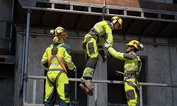 SystemerTjenester
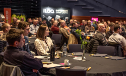 ForumOm oss
 Norsk
Norsk
Utvalgte kurs
Nytt kurs! Fallsikring
Vårt e-læringskurs Fallsikring gir deg økt kunnskap om bruk og inspeksjon av fallsikringsutstyr.
Les merUtvalgte systemer

Utvalgte tjenester
Arrangementer
Bli med på våre spennende events, fagsamlinger og gratis webinarer.
Se arrangementene våreNorsk


